Your Dashboards at a glance
Dashboards is a read-only snapshot of your cash, income, burn and runway for one period. Here is what every card shows and where each one leads.
Open your Dashboards
In the left navigation, click Home › Dashboards (or press G then D).
Pick the period with the period picker at the top. See Choosing a reporting period.
Dashboards opens on the last complete month, then moves once to the newest month that has activity. A period you pick yourself is never changed, but Dashboards doesn't remember it when you leave the page.
Nothing on Dashboards is edited here. Every figure is calculated from your ledger, so it changes when your books change.
What each card shows
| Card | What it shows |
|---|---|
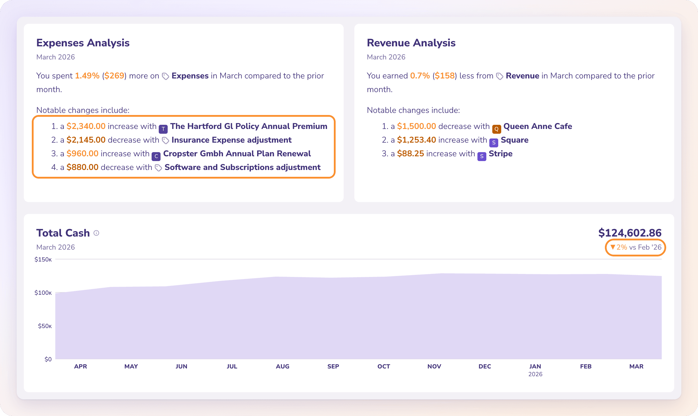
| Expenses Analysis / Revenue Analysis | A sentence comparing this period with the one before, then Notable changes include: with up to four vendors, customers or entries that moved the most. |
| Total Cash | The combined balance of your bank accounts at the end of the period. Credit cards are not included. |
| Gross Income | Revenue plus other income for the period. |
| Net Burn / Net Cash In | How much more money left your bank accounts than came in. The title changes to Net Cash In when more came in. |
| Runway / Live Runway | How many months (or quarters, or years) your cash lasts at your recent burn. |
| Cash Flow | Money in, money out and the net for your bank accounts. |
| Top Expense Categories | Your five largest expense categories this period, with the change from the period before. |
Net Burn and Cash Flow carry a CASH badge because they measure money moving through your bank accounts. How the cash cards are calculated is in How Runway, Net Burn and Total Cash are calculated.
Tip: The analysis sentences are not AI-written. ZeraBooks builds them from your figures, so they always match the numbers on the page.
Read the charts and change chips
Each chart covers the 12 periods up to the one you picked: 12 months when you pick a month, 12 quarters when you pick a quarter, 12 years when you pick a year. The chart starts no earlier than your books start date.
Hover a month on a chart to update that card's value and change chip for that month.
The change chip compares with the period before, for example ▲48% vs Jun '26. It is teal when the change is good for you (more income, less spending) and orange when it isn't.
While the period is still running, the cards read as of Today and the analysis adds This month is in-flight so insights may change.
Go from a card to the detail
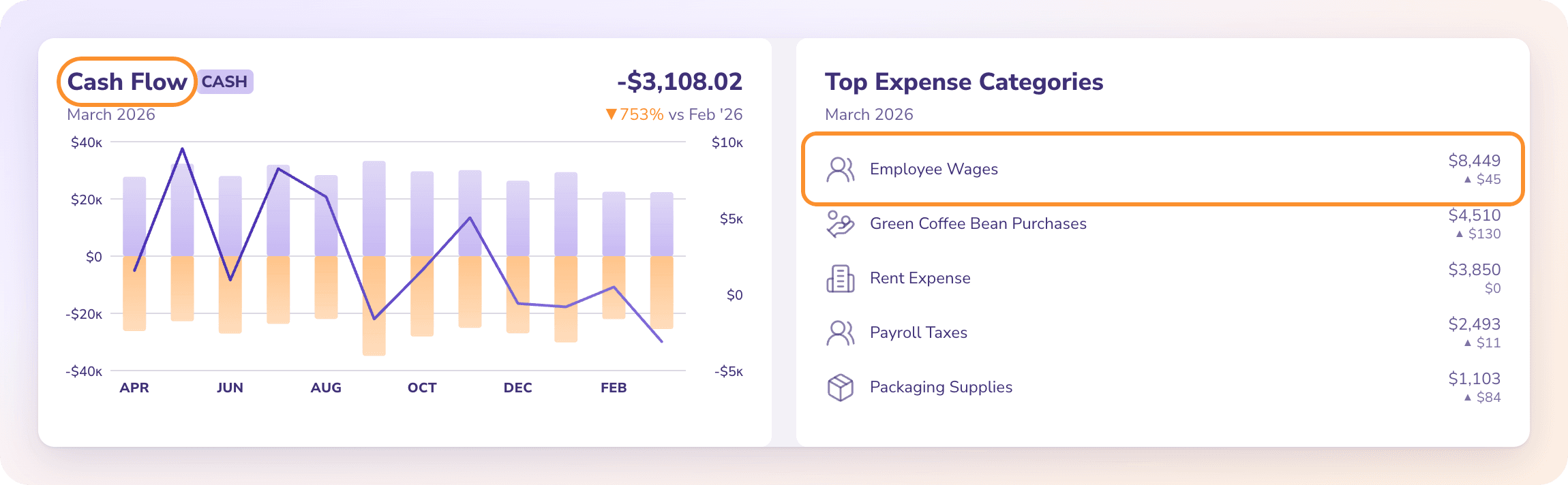
Click a row in Top Expense Categories to open the Ledger filtered to that category and period.
Click a vendor or customer in Notable changes include: to open it in Vendors or Customers. Movers that aren't a saved vendor or customer open the Expenses or Revenue page instead.
Click the section name in an analysis sentence (for example Expenses) to open that page. See Explore Expenses, Revenue and Cost of Revenue.
Above the cards
The Autopilot strip reads, for example, "Autopilot · 42 things done for you in the last 30 days · 91% hands-off". Its pill shows how many questions need you, or Nothing needs you. Click it to open Autopilot. See What Autopilot does.
The setup guide appears on a company that isn't fully set up. It shows one next step, such as Set up categories, Add an account or Upload a statement, and disappears once setup is done.
Frequently Asked Questions
Why does Dashboards show last month instead of this month?
Because it opens on the last complete month, then moves to the newest month that has activity. Pick This Month in the period picker to see the running month.
Can I add, remove or rearrange dashboard cards?
No. Dashboards has one fixed set of cards. To build your own selection of charts and statements, use a custom report.
Is the analysis text written by AI?
No. It is composed from the calculated figures, with no AI involved, so it always agrees with the numbers.
Why is Top Expense Categories higher than my Expenses page?
Because Top Expense Categories on Dashboards includes cost of revenue. The Expenses page doesn't; cost of revenue has its own page.
What does "Nothing to compare yet" mean?
There's nothing earlier to compare with. The analysis reads the period you picked against the one before it, and there's no earlier activity to compare against yet, usually because the books start in this period.
Why does the dashboard say "Could not load the dashboard"?
The figures couldn't be fetched. Check your connection and click Retry dashboard.
Can I download or print Dashboards?
No. Dashboards has no download button. Put the same charts in a custom report and download it as a PDF.
Learn more about AI-native general ledger: A double-entry ledger where statements become proven transactions.
Still stuck? A real person reads every message—come say hello.